Quick start (v2)
Building Your To-Do App: A Beginner’s Journey with Qbit Components - 2
This tutorial guides you through creating a simple TODO application using React, TypeScript, TailwindCSS, and the Qbit Design library. By the end of this guide, you’ll have a clear understanding of key concepts such as components, state management, and Qbit skins.
Step 1: Create a React Application with TypeScript
Before anything else, you’ll need to have Node.js installed. This is the tool that allows us to run React (which is the framework we'll use to build our app). You can download Node.js from here.
Once that’s done, let’s create our project folder. Open your terminal (or command prompt) and run:
npx create-react-app todo-app --template typescript
cd todo-app
This command creates a new React project named todo-app with TypeScript support. The --template typescript ensures the project uses TypeScript.
Step 2: Install TailwindCSS
To make our app beautiful, we’ll be using Tailwind CSS, a utility-first CSS framework. This will help style our app quickly without needing to write custom CSS. Follow these steps to install it:
npm install -D tailwindcss postcss autoprefixer
npx tailwindcss init
Then, go into the tailwind.config.js file and update it with:
module.exports = {
  content: ["./src/**/*.{js,jsx,ts,tsx}"],
  theme: {
    extend: {},
  },
  plugins: [],
};
Next, open the src/index.css file and replace its contents with:
@tailwind base;
@tailwind components;
@tailwind utilities;
After that, your project is ready to style with Tailwind.
Run the project:
npm start
Output
Step 3: Project Folder Structure
Organize your project as follows:
src/
  todo/
    interface/
      ITodo.ts
    skins/
      Button.skin.todo.close.tsx
      Button.skin.todo.tsx
      Card.skin.todo.tsx
      Modal.skin.todo.tsx
      TextInput.skin.todo.tsx
    TodoForm.tsx
    TodoList.tsx
  App.tsx
  index.css
Step 4: Modify App.tsx
const App = () => {
  return (
    <div className="max-w-4xl mx-auto mt-12">
      <h2 className="text-3xl font-bold text-center">TODO</h2>
    </div>
  );
};

export default App;
- This creates the main layout for the TODO application.
- The
max-w-4xlcenters the content and sets a maximum width.
Output

Step 5: Create TodoForm.tsx and TodoList.tsx
src/todo/TodoForm.tsx
const TodoForm = () => {
  return (
    <form className="mt-8">
      {/*  */}
    </form>
  );
};

export default TodoForm;
src/todo/TodoList.tsx
const TodoList = () => {
  return (
    <div>
      {/*  */}
    </div>
  );
};

export default TodoList;
Step 6: Integrate Components into App.tsx
import TodoList from './todo/TodoList';
import TodoForm from './todo/TodoForm';

const App = () => {
  return (
    <div className="max-w-4xl mx-auto mt-12">
      <h2 className="text-3xl font-bold text-center">TODO</h2>

      <TodoForm />

      <TodoList />
    </div>
  );
};

export default App;
- This integrates the form for adding TODOs and the list for displaying them.
Step 7: Enhance TodoForm
Add Form Submit Function:
const TodoForm = () => {
  const handleAddTodo = () => {};

  return (
    <form className="mt-8" onSubmit={handleAddTodo}>
        {/*  */}
    </form>
  );
};

export default TodoForm;
- The `handleAddTodo` function is necessary for intercepting the form submission event and handling custom logic, such as adding a new TODO item.
Handle Submit:
const handleAddTodo = (e: React.FormEvent) => {
  e.preventDefault();
};
- Adding `preventDefault` ensures the page does not reload when the form is submitted, allowing us to handle the logic entirely within React.
Step 8: Add Input Field Using Qbit TextInput Component into TextForm
import React, { useState } from 'react';
import { TextInput } from '@components/inputs';
import TodoSkinTextInput from './skins/TextInput.skin.todo';

const TodoForm = () => {
    const [task, setTask] = useState<string>('');

    const handleAddTodo = (e: React.FormEvent) => {
        e.preventDefault();
    };

    return (
        <form className="mt-8" onSubmit={handleAddTodo}>
            <label htmlFor="todo" className="text-sm/6 font-medium text-gray-900">
                Todo
            </label>
            <TextInput
                type="text"
                name="todo"
                id="todo"
                autoComplete="off"
                placeholder="Enter your todo"
                required
                value={task}
                onChange={(e: React.ChangeEvent<HTMLInputElement>) => setTask(e.target.value)}
            />
        </form>
    );
};

export default TodoForm;
Explanation of const [task, setTask] = useState<string>('');
This line creates a state variable in React to store and update the user's input.
How It Works:
task: Holds the current value of the state. Initially, it's an empty string ('').setTask: A function used to update thetaskstate when the user types in the input field.useState<string>: A React Hook that manages state in functional components. The<string>type ensures thetaskvariable only holds string values.
Explanation of value and onChange in TextInput
value Property:
The value property binds the input field's content to the task state. This means:
- The input field always displays the current value of
task. - If
taskis updated, the input field automatically reflects the new value.
onChange Event Handler:
The onChange property listens for changes in the input field and updates the task state accordingly.
How It Works:
- When the user types into the input field, the
onChangefunction is triggered. setTask(e.target.value)updates the state with the user's input (e.target.value).
Combined Functionality:
By using value and onChange together:
- The input field is always synchronized with the
taskstate. - The app can react to user input in real time.
value={task}ensures the input field displays the current state.onChangeupdates the state as the user types.
By understanding these properties, you’ll be able to handle user inputs dynamically in your React application.
If you want more details about managing state in React, visit React's State Management.
You should pass the renderer. If it's not passed it will throw an error like No Renderer Specified
Output
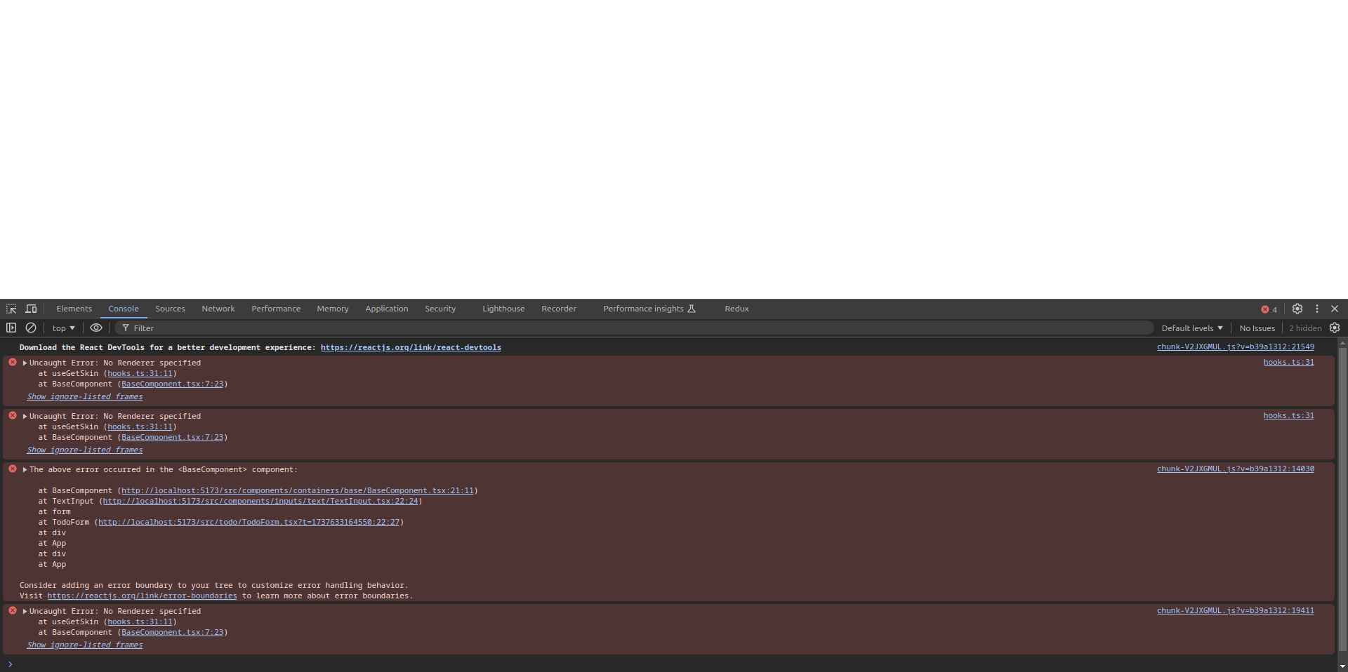
- You should pass the renderer. If it's not passed it will throw an error like No Renderer Specified. So you need to pass the skin into the renderer prop.
- You can import the pre-designed skins from Qbit Designs. you can check the official documentation to know about the skins. OR you can design your customized skin and pass it into the renderer prop.
Step 9: Create Custom Skin For TextInput
To resolve the error, create a custom skin for the TextInput component.
src/todo/skins/TextInput.skin.todo.tsx
const TodoSkinTextInput: com.qbit.Skin<TextInputProps> = () => {
  return (
    <div>
        {/*  */}
    </div>
  );
};

export default TodoSkinTextInput;
Update TodoSkinTextInput:
const TodoSkinTextInput: com.qbit.Skin<TextInputProps> = (props: com.qbit.SkinProps<TextInputProps>) => {
  const {
    name,
    id,
    type,
    value,
    placeholder,
    required,
    disabled,
    maxLength,
    autoComplete,
    onChange,
  } = props;

  return (
    <input
      id={id}
      name={name}
      type={type}
      value={value}
      placeholder={placeholder}
      required={required}
      disabled={disabled}
      maxLength={maxLength}
      autoComplete={autoComplete}
      className="block w-full rounded-md bg-white px-3 py-2 text-base text-gray-900 outline outline-1 -outline-offset-1 outline-gray-300 placeholder:text-gray-400 focus:outline focus:outline-2 focus:-outline-offset-2 focus:outline-[#212121] sm:text-sm/6"
      onChange={(event) => onChange?.(event)}
    />
  );
};

export default TodoSkinTextInput;
For instance, if you're creating a skin for a TextInput, you can use TextInputProps as shown below:
const TodoSkinTextInput: com.qbit.Skin<TextInputProps> = (props: com.qbit.SkinProps<TextInputProps>) => {
- The component uses the TypeScript generic type
com.qbit.Skin<TextInputProps>, which enforces that the props (TextInputProps) adhere to the provided type definition. TextInputPropsdefines the properties that can be passed to this component. (The exact definition ofTextInputPropsis not included here, but its usage is demonstrated below.)
Destructuring Props
You can destructure the props for easier access:
const { name, id, type, value, placeholder, required, disabled, maxLength, autoComplete, onChange } = props;
Props Explanation
name: The name of the input field.id: A unique identifier for the input field.type: Specifies the type of input (e.g.,text,password, etc.).value: The current value of the input field.placeholder: Placeholder text displayed when the input field is empty.required: Boolean indicating whether the field is required.disabled: Boolean indicating whether the field is disabled.autoComplete: Specifies whether the input should have autocomplete functionality.onChange: Event handler for changes to the input's value.
Here we are using required props for the skin. You can check for the official documentation for other props. Check here
Styling
The component uses Tailwind CSS for styling.
- Base Styles:
block w-full rounded-md bg-white px-3 py-2 text-base text-gray-900creates a full-width, rounded input with padding and default text styles.
- Outline Behavior:
outline outline-1 -outline-offset-1 outline-gray-300adds a subtle outline for better visibility.- Focus styles (
focus:outline focus:outline-2 focus:-outline-offset-2 focus:outline-[#212121]) highlight the input when it's focused.
- Placeholder Styling:
placeholder:text-gray-400ensures the placeholder text is subtly visible.
- Responsive Text Size:
sm:text-sm/6adjusts text size for smaller screens.
Event Handling
The onChange handler listens for input changes and updates the value accordingly. Optional chaining ensures no error occurs if onChange is undefined.
Update TodoForm:
Modify the TextInput component in TodoForm to use the custom renderer.
import TodoSkinTextInput from './skins/TextInput.skin.todo';

<TextInput
  type="text"
  name="todo"
  id="todo"
  placeholder="Enter your todo"
  required
  value={task}
  onChange={(e: React.ChangeEvent<HTMLInputElement>) => setTask(e.target.value)}
  renderers={{ renderer: TodoSkinTextInput }}
/>
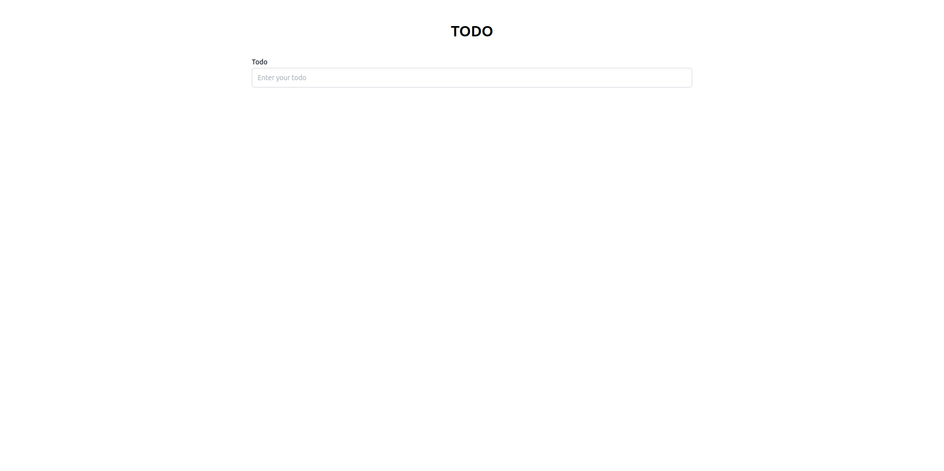
Output
Step 10: Add Button Using Qbit Button Component into TextForm
import React, { useState } from 'react';
import { Button, TextInput } from '@components/inputs';
import TodoSkinTextInput from './skins/TextInput.skin.todo';

const TodoForm = () => {
  const [task, setTask] = useState<string>('');

  const handleAddTodo = (e: React.FormEvent) => {
    e.preventDefault();
  };

  return (
    <form className="mt-8" onSubmit={handleAddTodo}>
      <label htmlFor="todo" className="text-sm/6 font-medium text-gray-900">
        Todo
      </label>
      <TextInput
        type="text"
        name="todo"
        id="todo"
        autoComplete="off"
        placeholder="Enter your todo"
        required
        value={task}
        onChange={(e: React.ChangeEvent<HTMLInputElement>) => setTask(e.target.value)}
        renderers={{ renderer: TodoSkinTextInput }}
      />

      <div className="mt-3">
        <Button value="Add Todo" onClick={() => {}} />
      </div>
    </form>
  );
};

export default TodoForm;
You should pass the renderer. If it's not passed it will throw an error like No Renderer Specified
Output
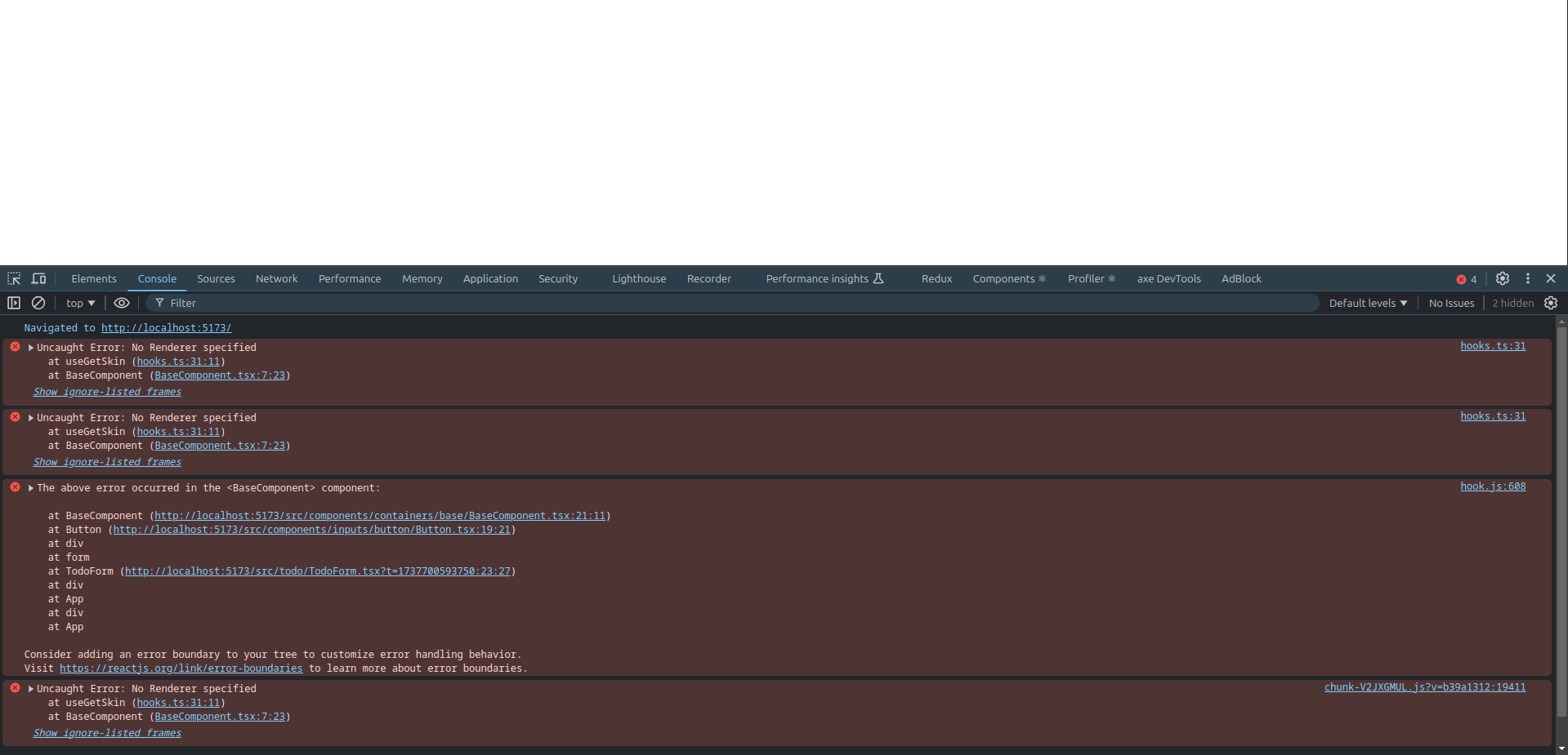
- You should pass the renderer. If it's not passed it will throw an error like No Renderer Specified. So you need to pass the skin into the renderer prop.
- You can import the pre-designed skins from Qbit Designs. you can check the official documentation to know about the skins. OR you can design your customized skin and pass it into the renderer prop.
Step 11: Create Custom Skin for Button
To resolve the error, create a custom skin for the Button component.
src/todo/skins/Button.skin.todo.tsx
const TodoSkinButton: com.qbit.Skin<ButtonProps> = () => {
  return (
    <div>
      {/*  */}
    </div>
  );
};

export default TodoSkinButton;
Update TodoSkinButton:
const TodoSkinButton: com.qbit.Skin<ButtonProps> = () => {
  const { value, onClick, disabled } = props;

  return (
    <button
      disabled={disabled}
      onClick={onClick}
      className="flex w-full justify-center rounded-md bg-[#212121] px-3 py-2 text-sm/6 font-semibold text-white shadow-sm hover:bg-neutral-900 focus-visible:outline focus-visible:outline-2 focus-visible:outline-offset-2 focus-visible:outline-[#212121]"
    >
      {value}
    </button>
  );
};

export default TodoSkinButton;
For instance, if you're creating a skin for a Button, you can use ButtonProps as shown below:
const TodoSkinButton: com.qbit.Skin<ButtonProps> = (props: com.qbit.SkinProps<ButtonProps>) => {
- The component uses the TypeScript generic type
com.qbit.Skin<ButtonProps>, which enforces that the props (ButtonProps) adhere to the provided type definition. ButtonPropsdefines the properties that can be passed to this component. (The exact definition ofButtonPropsis not included here, but its usage is demonstrated below.)
Destructuring Props
You can destructure the props for easier access:
const { value, onClick, disabled } = props;
Props Explanation
value: Text displayed on the button.onClick: Event handler triggered when the button is clicked.disabled: Boolean to disable the button when necessary.
Here we are using required props for the skin. You can check for the official documentation for other props. Check here
Styling
The component uses Tailwind CSS for styling.
- Base Styles:
flex w-full justify-center rounded-md bg-[#212121] px-3 py-2 text-sm/6 font-semibold text-white- Creates a full-width button with a dark background, centered text, and rounded corners.
- Hover Effect:
hover:bg-neutral-900- Changes the background to a slightly lighter shade when hovered.
- Focus Styles:
focus-visible:outline focus-visible:outline-2 focus-visible:outline-offset-2 focus-visible:outline-[#212121]- Adds a visible outline for accessibility when the button is focused.
Event Handling
The onClick handler listens for click events and executes the specified function. Optional chaining ensures no error occurs if onClick is undefined.
Update TodoForm:
Modify the Button component in TodoForm to use the custom renderer.
import TodoSkinButton from './skins/Button.skin.todo';

<Button
  renderers={{ renderer: TodoSkinButton }}
  value="Add Todo"
  onClick={() => {}}
/>
Output
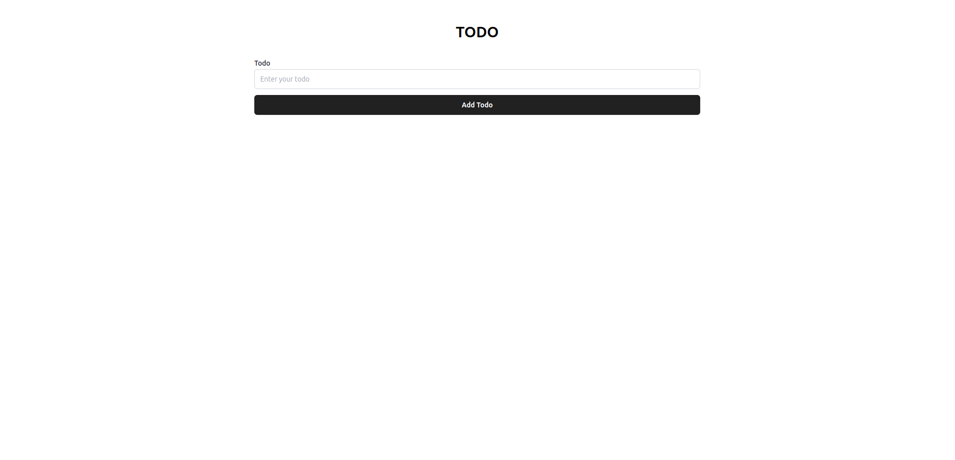
Step 12: Define the ITodo Interface and Initialize State in App
In this step, you’ll create an interface to structure TODO items and use it to define the state in the App component.
src/todo/interface/ITodo.ts
Create an interface for TODO items to enforce a consistent structure.
export interface ITodo {}
Update ITodo
export interface ITodo {
  date: Date;
  task: string;
}
date: ADateobject representing when the TODO was created.task: Astringcontaining the TODO description.
Step 13: Initialize State in App
Modify the App component to include state for a single TODO item.
Updated App.tsx
import { useState } from 'react';
import TodoForm from './todo/TodoForm';
import { ITodo } from './todo/interface/ITodo';

const App = () => {
  const [todo, setTodo] = useState<ITodo[]>([]);

  return (
    <div className="max-w-4xl mx-auto mt-12">
      <h2 className="text-3xl font-bold text-center">TODO</h2>
      <TodoForm />
    </div>
  );
};

export default App;
Explanation
useState<ITodo>(): Initializes a state variabletodowith the typeITodo.- This setup will allow the application to manage individual TODO items in the state.
Step 14: Define ITodoForm Interface into ITodo.ts
In this step, you’ll define an interface for the TodoForm component and update its functionality to manage the TODO list state.
import React from 'react';

export interface ITodoForm {
  setTodos: React.Dispatch<React.SetStateAction<ITodo[]>>;
}
Updated ITodoForm
import React from 'react';

export interface ITodoForm {
  setTodos: React.Dispatch<React.SetStateAction<ITodo[]>>;
}
setTodos: A function to update the TODO list state.- Type:
React.Dispatch<React.SetStateAction<ITodo[]>> - This type is provided by React and ensures the
setTodosfunction is correctly typed.
- Type:
Update TodoForm to Use ITodoForm
Modify the TodoForm component to accept the setTodos function as a prop.
Updated TodoForm.tsx
import React, { useState } from 'react';
import { ITodo, ITodoForm } from './interface/ITodo';
import { TextInput } from '@components/inputs';
import TodoSkinTextInput from './skins/TextInput.skin.todo';
import TodoSkinButton from './skins/Button.skin.todo';

const TodoForm = (props: ITodoForm) => {
  const { setTodos } = props;
  const [task, setTask] = useState<string>('');

  const handleAddTodo = (e: React.FormEvent) => {
    e.preventDefault();

    if (task.trim()) {
      setTodos((prev) => [...prev, { date: new Date(), task: task.trim() }]);
      setTask('');
    }
  };

  return (
    <form className="mt-8" onSubmit={handleAddTodo}>
      <label htmlFor="todo" className="text-sm/6 font-medium text-gray-900">
        Add TODO
      </label>
      <TextInput
        type="text"
        name="todo"
        id="todo"
        placeholder="Enter your todo"
        required
        value={task}
        onChange={(e: React.ChangeEvent<HTMLInputElement>) => setTask(e.target.value)}
        renderers={{ renderer: TodoSkinTextInput }}
      />

      <div className="mt-3">
        <button type="submit" className="w-full">
          <TodoSkinButton value="Add Todo" />
        </button>
      </div>
    </form>
  );
};

export default TodoForm;
Explanation
- Added
ITodoFormProp:
- The
setTodosfunction is passed as a prop to theTodoFormcomponent. - This allows
TodoFormto update the parent component's TODO list state.
- Updated
handleAddTodoFunction:
- Checks if
task.trim()is non-empty before updating the TODO list. - Creates a new TODO object with the current date and trimmed task.
- Resets the input field after adding the TODO.
- Typing Improvements:
- The
ITodoForminterface ensures thesetTodosprop is strongly typed, reducing potential errors.